Another chart showing college tuition is increasing at a steepening rate:

And is causing families to spend a greater portion of the family budget to pay for college expenses, thus making college “more expensive”:

(If unable to view chart, click)
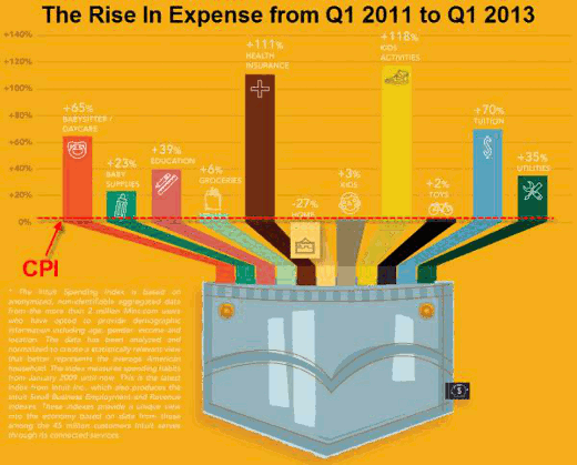
The Rise in Expense from Q1 [January-March] 2011 to Q1 [January-March] 2013.
(Bar graph description from left to right.)
- Red bar: +65% Babysitter/Daycare
- Green bar: +23% Baby Supplies
- Pink bar: +39% Education
- Aqua bar: +6% Groceries
- Brown bar: +111% Health Insurance
- Yellow bar: -27% Home
- Grey bar: +3% Kids
- Yellow bar: +118% Kid Activities
- Black bar: +2% Toys
- Blue bar: +70 Tuition
- Dark Green bar: +35% Utilities
*The Intuit Spending Index is based on anonymized, non-identifiable aggregated data from the more than 2 million Mint.com users who have opted to provide demographic information including age, gender, income and location. The data has been analyzed and normalized to create a statistically relevant view that better represents the average American household. The index measures spending habits from January 2009 until now. This is the latest index from Intuit Inc., which also produces the Intuit Small Business Employment and Revenue Indexes. These indexes provide a unique view into the economy based on data from those among the 45 million customers Intuit serves through its connected services.
Chart Credit: Doug Short
Infographic Credit: mint.com/Intuit


